Responsive Website Design
Developed a brand and responsive website design for a youth camp in Poland, enhancing usability, mobile compatibility, and creating a cohesive identity that attracted participants through organic traffic and met enrollment targets.
Goal
Challenge

UI
UX
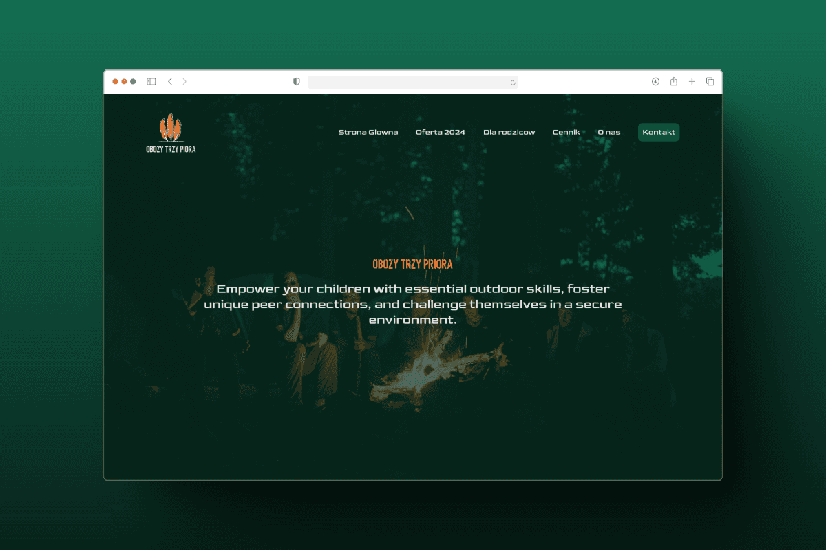
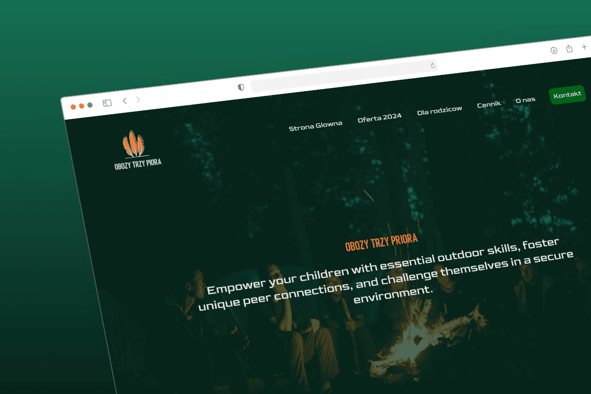
Responsive design that can be scaled.
Reviews from parents.
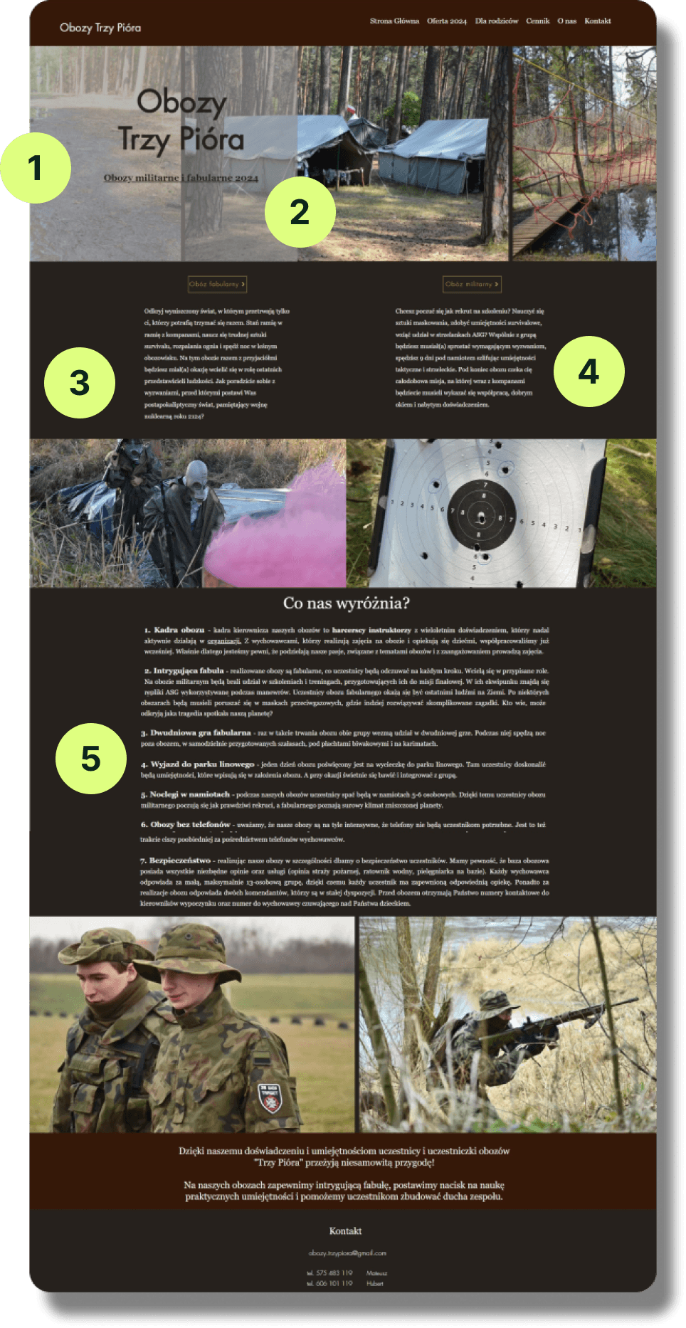
Final Design
3800
per month
Avg Number of Visits
90%
Mobile Users
90%
Organic Search
0.42%
Conversion Rate
By optimizing the website for mobile compatibility, I ensured that 90% of visitors enjoyed a user-friendly experience. Incorporating clear CTAs and industry-specific language helped the website attract 90% of its traffic through organic searches. While the conversion rate was relatively low compared to the total number of visitors, this is expected for a new and small business. However, within the first three months, the camp met its target number of participants, marking the project as a success.
Discovery | Understanding the Problem Space
Business Goals
Primary
Build trust & legitimacy in the brand.
Secondary
Broaden the website's reach to appeal to a wider audience.
Target Audience
Primary
Parents/Guardians
Secondary
Teachers/ School Representatives
Product Details
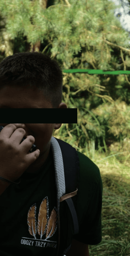
Youth Overnight Camp
Set Dates/Times
Role Playing/Adventure
Limited Availability
Skills Development
Social Learning/ Hands on Activities
Method
Content Overview: I started by requesting Google Translate integration on their existing website to make the content accessible to me.
User Interviews: Speaking to parents within my network to understand what they look for when considering summer camps, what builds trust, and what raises red flags.
Market Research: By analyzing competitor sites, I began visualizing the framework for the content, considering how colors and imagery would establish the tone and enhance the UX writing.
Evaluation of the Current Site
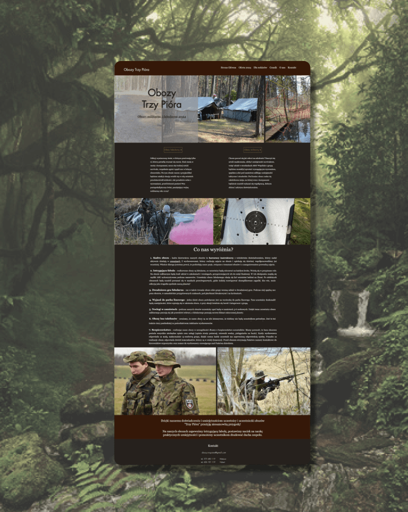
The current website is not responsive (mobile friendly).
Content positioning breaks the top down rule.
Buttons are incorrectly placed onto of the content.
The site is content-heavy with no clear structure, making it difficult for users who tend to scan rather than read.
The visual hierarchy is unclear, and the images disrupt the natural reading flow.
Insights
Address parents' safety concerns early while emphasizing education and skill development for the children.
New user scenarios highlight the need for regulatory authorities to access clear and accessible information about the brand's qualifications and expertise.
Photos and videos can visually demonstrate safety, skills developement.
Photos and video content can be shared, encouraging referrals within the community.

Analysis
Examining the layout of the homepage, analyzing the structure of information across the site.
Mapping user flows to understand how visitors navigate and find key information.
Creating a prioritization matrix, and consulting the client to ensure time and budget alignment.
This comprehensive approach ensured that the website delivers a user-friendly experience while effectively communicating the brand’s value and expertise.
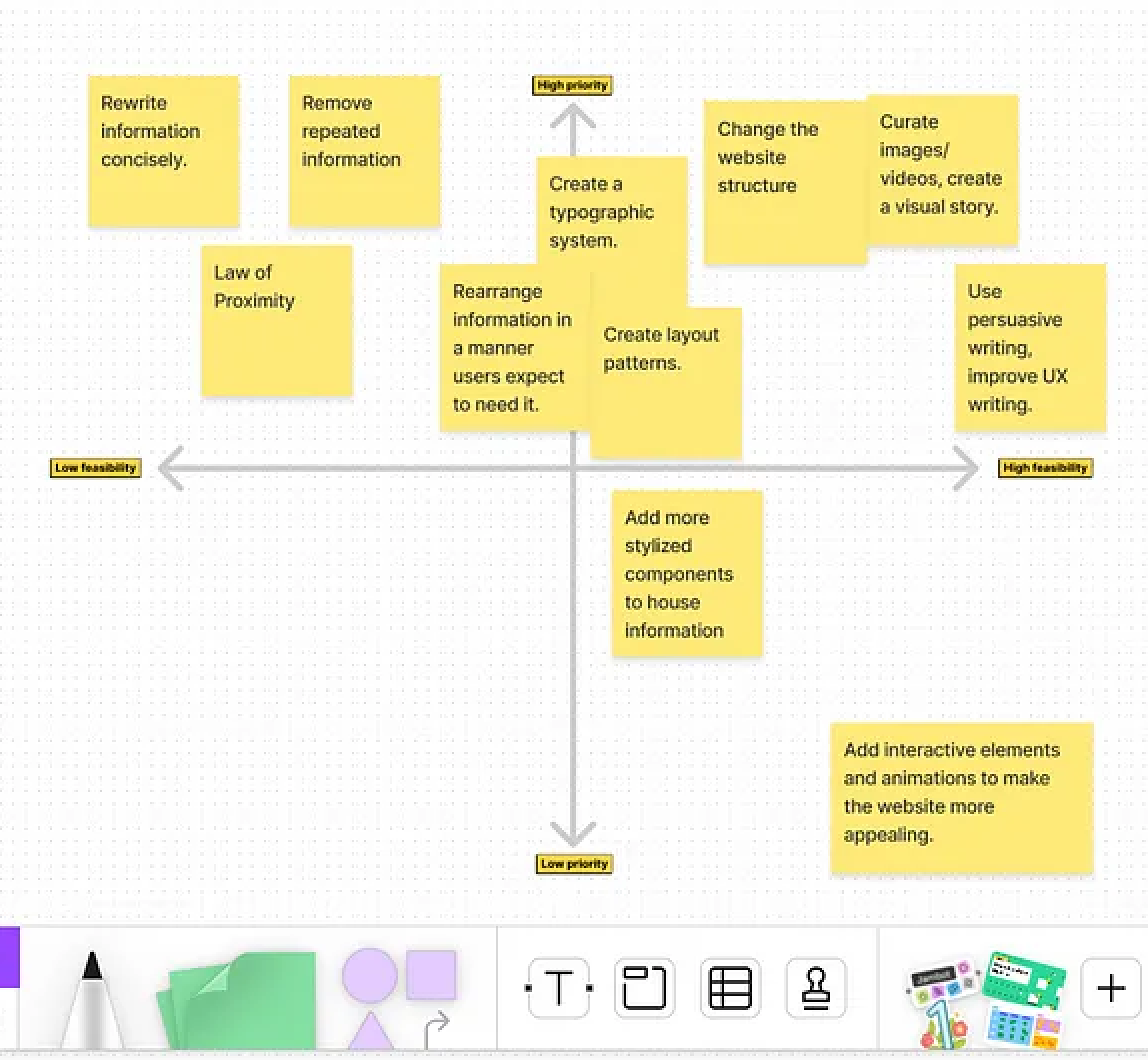

Focus
Aesthetic and Minimalistic Design: The website should eliminate irrelevant information, as every unnecessary element competes with the essential content.
Visual Hierarchy: Content should be organized to guide the user’s eye naturally, structuring the layout into clearly distinguishable sections.
To illustrate how these principles could be applied, I provided two design examples, demonstrating how to adhere to these rules while accommodating different project timelines — one for a quicker turnaround and one for a longer-term approach. I wanted the client to have flexibility knowing they have limited resources and time.
Client Check-In
Mid-Fi Wireframes
Information Architecture
Layout
Navigation

Reorganize existing information.
Reduce clutter & Improve aesthetic
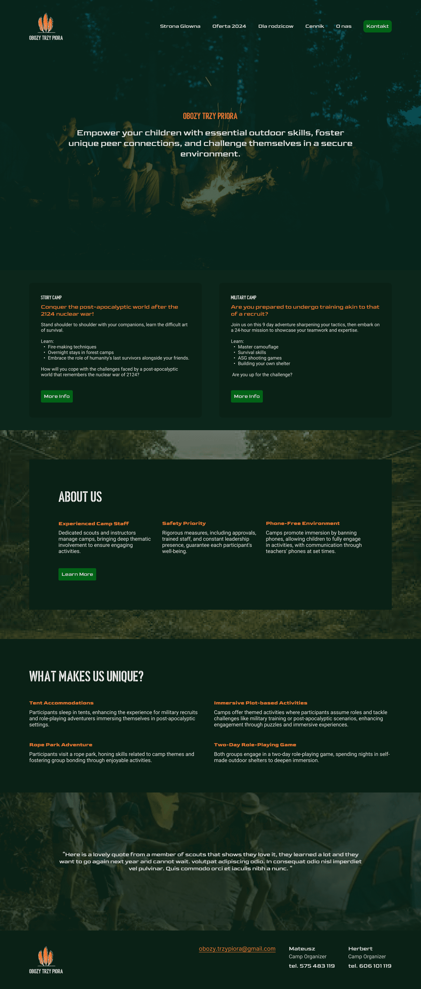
Option 1 showcases how the existing design and information can be reorganized to enhance usability. It highlights that effective design often involves simple adjustments to the structure, making it clearer and more concise.

Add marketing content i.e parent reviews.
Explain the brands mission & vision.
Show the two camp options, with concise descriptions, with links to full pages.
Option 2 incorporates more stylistic elements, such as focused imagery and strategic calls-to-action (CTAs). Additional content to create a natural flow throughout the page, presenting information in the order users are likely to need it. This includes an introduction to the camp, testimonials from parents, a breakdown of what’s included, and details about the two types of camps available.
Next Steps
The client decided to extend the project timeline and move forward with Option 2, opting for a more comprehensive design approach. They recognized the value of applying established design principles, like the Gestalt principles, to create a cohesive and visually engaging user experience. This extension reflects their commitment to a process that prioritizes not only aesthetics but also usability, accessibility, and overall user satisfaction.