Project Overview
My Role
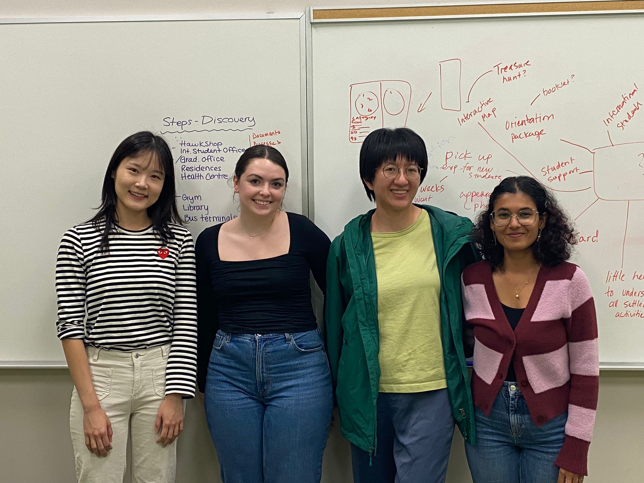
Team


Project
Tools
x3
Rounds of Testing
10
Participants
Discovery
We began by mapping the current system with a service map, identifying four separate platforms students must navigate for profile management, course selection, financial management, and information gathering. This fragmented system often leaves students struggling to remember which platform provides specific services. Some services overlap across platforms, redirecting users due to an ongoing university system update, further adding to the confusion. As a result, many students rely on trial and error to complete tasks or locate information, with some avoiding services altogether.

Planning
To design the OneCard app, we analyzed the system’s key features and identified fund management and building access as the most frequently used services by students. We pinpointed critical gaps and compiled a detailed list of issues to address, spanning minor inconveniences to larger systemic challenges. Drawing inspiration from best practices in other applications, we aimed to align our solution with existing student mental models for a seamless user experience.
The Wilfrid Laurier OneCard is a versatile tool for students, serving as identification, a payment method, and a gateway to university services. However, its current design falls short in addressing inclusivity and providing user-friendly management features. Our goal is to create a modern, mobile application that supports on-the-go functionality, streamlines planning and task completion, and enhances students' confidence in the Laurier brand.


UX Research Results
Most Liked Features
Minimalist design: 80% of students had no trouble completing tasks.
Fund management: Of the users currently using the fund management feature 50% agreed the app would greatly enhance their experience.
Building access: All students agreed this would benefit them.
User’s Suggestions
Clear Navigation: Make the structure of the app more clear, switching between pages caused confusion for 30% of users.
System & Real World Match: Improving the visual language to be more accessible, using clear icons and color hierarchy to guide users.
Live Updates: Students mentioned this as a desired feature to make purchasing decisions easier.
UX Research Results
Mid-Fi
Hi-Fi
8/10 users found the dashboard intuitive.
40% of users were confused by 'Campus Access' title. And did not find the shortcut useful.
In the ‘Updates’ section, participants wanted to see the university news or learn about the OneCard.
UX Research Results

Design A
Feedback Toast Missed
Unexpected shift to digital OneCard from fund management.
Users felt like this was a forced action.

Design B
Clear feedback message.
Isolated task completion was preferred.
Users appreciated the breakdown of added funds, current funds.

Design B (Final Design)
Branded
Purchase button easier to reach.
Content hierarchy established.
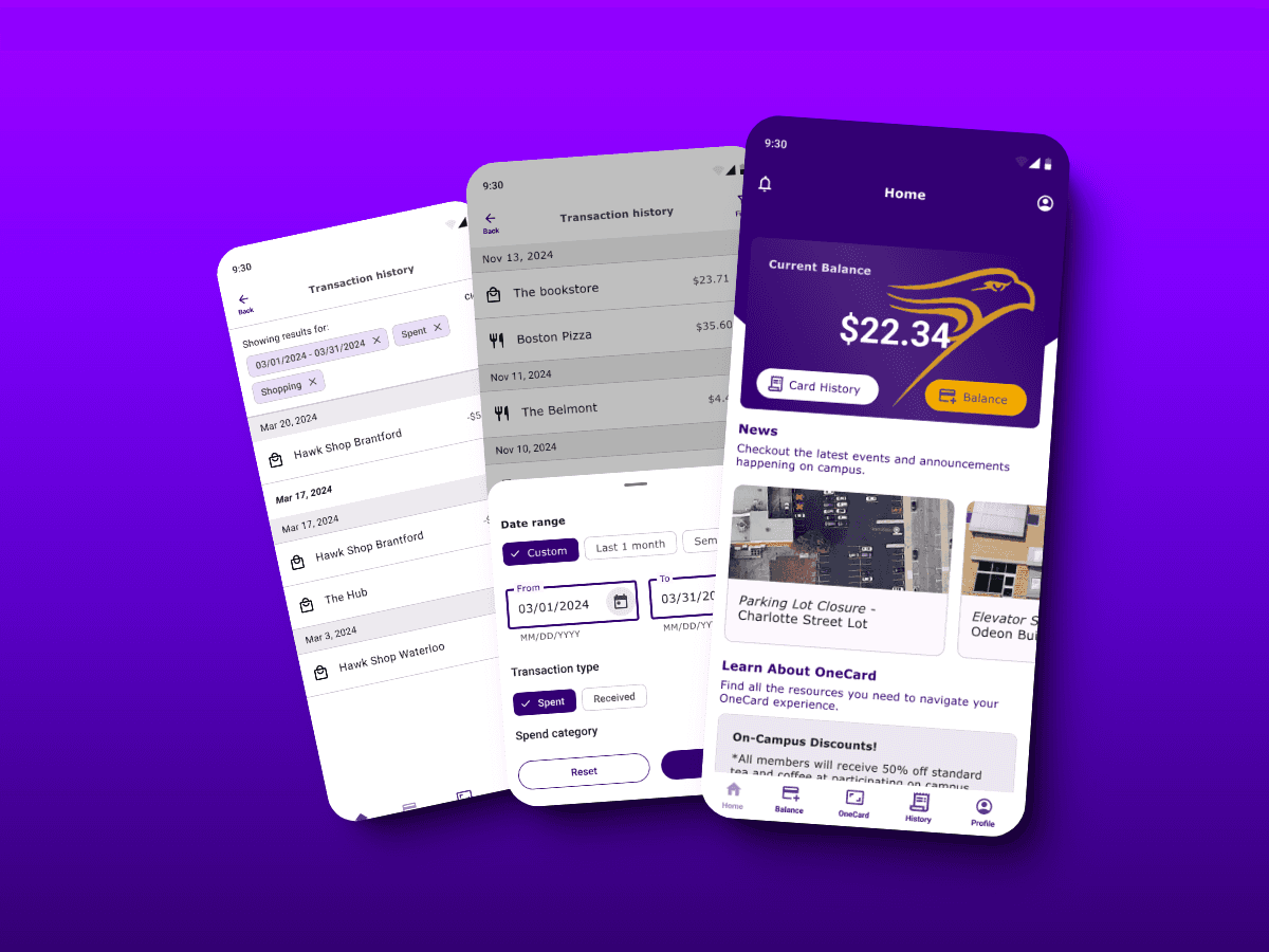
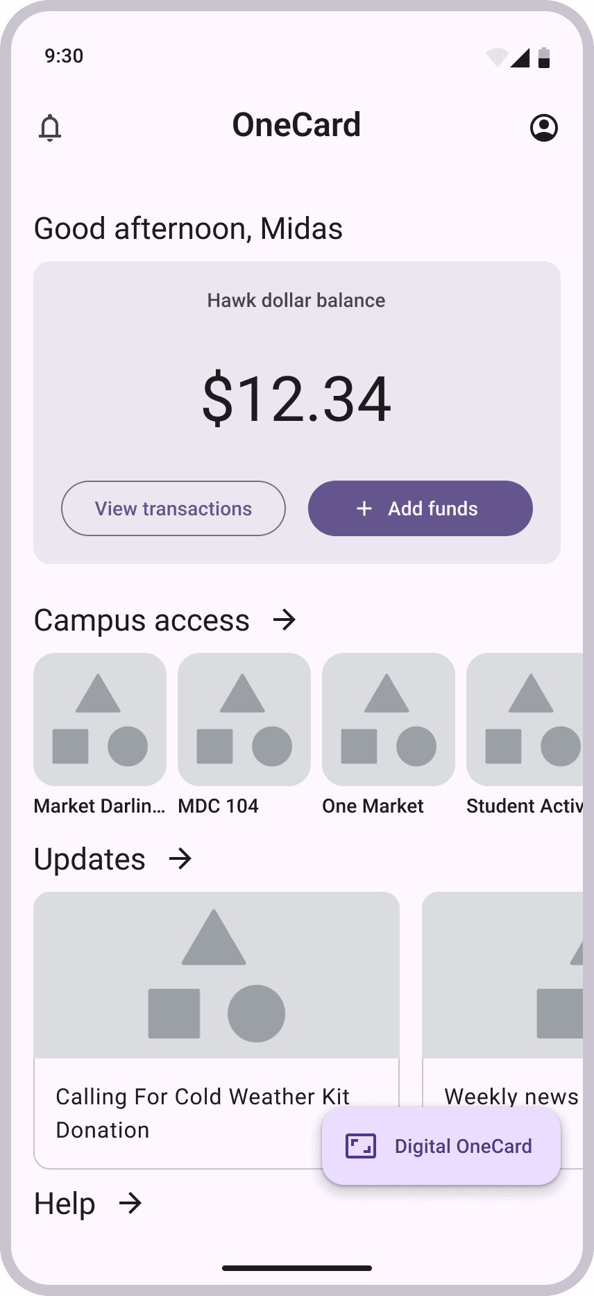
Fund Management
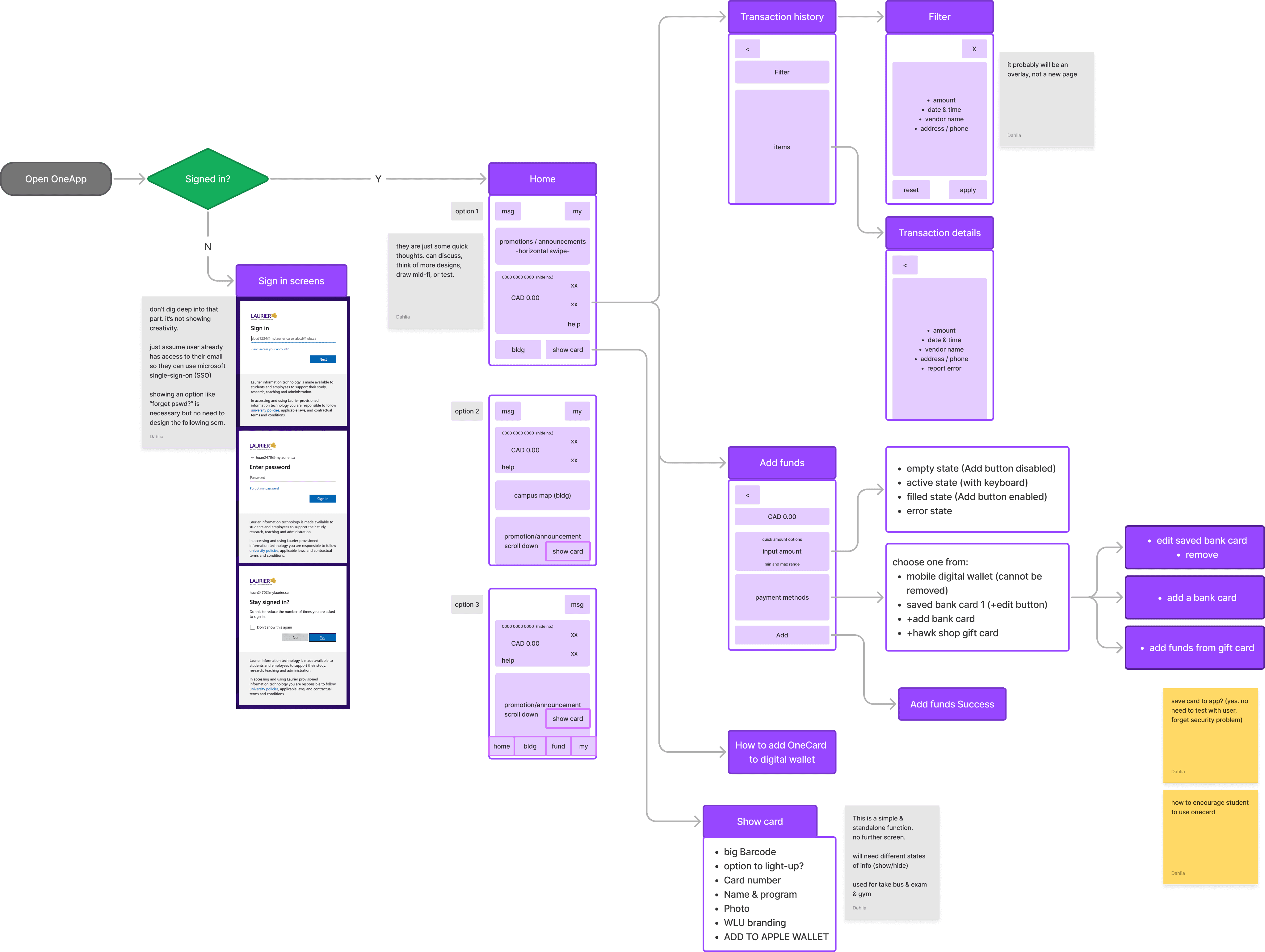
Currently students have to go to the Laurier website, find the fund management page and fill out a 10 step form to add funds. Our design reduces the steps to just two, utilizing saved information and adding intuitive feedback like confirmation messages and displaying their balance.

Confirmation Screen
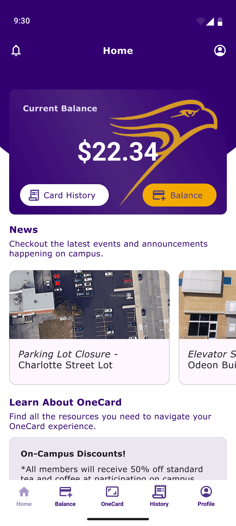
Transaction History
Students currently rely on the OneCard office or their personal financial accounts for accurate information. During testing, users found the transaction tracking feature highly appealing, though they deemed the filter function less useful. They valued the ability to view individual transactions and report incorrect charges directly through the app. This feature fosters trust between students and the OneCard office by offering transparency in refund procedures and account management.


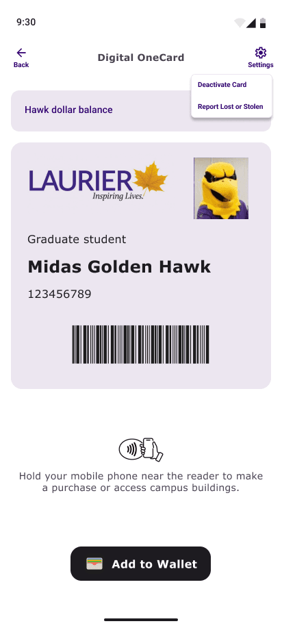
Building Access
Student’s are often running to class in stress, fleeing the Canadian weather or simply chatting to friends. The ideal system would be one where they don’t have to think, they know when the door is unlocked. The current system provides feedback through terminal colors (red for denied access, green for granted, and blue for error), but most students in user testing were unaware of this. Our redesigned system achieved a 100% success rate in user testing, with all students expressing enthusiasm for this design.


Holistic Design Thinking
Alongside the app, we also designed an orientation booklet to support new and international students in navigating the OneCard system. This booklet serves as a practical and impactful onboarding tool, providing clear guidance on essential services such as healthcare, course registration, and other critical resources. Distributed with the OneCard, it aims to simplify the student experience from the start.
Additionally, the university could adopt a proactive approach to addressing student concerns about fee breakdowns, fostering ensuring transparency.
Empowering students should be a central goal of the OneCard system. Many students currently spend significant time piecing together basic information, leading to frustrations that contribute to a less positive university experience. By embracing a holistic approach to system redesign—not limited to digital solutions—we can better meet students’ needs and significantly enhance their overall experience.

Future Considerations