
Conference Planning App
Conference Planning App
Gathering Our Voices (GOV) is a Indigenous Youth conference application for purchasing tickets, signing-up for workshops and browsing program information.
Gathering Our Voices (GOV) is a Indigenous Youth conference application for purchasing tickets, signing-up for workshops and browsing program information.
Client
Gathering Our Voices
Role
User Experience Designer
Team
Five Person Team
Year
2022 -2023
We were mandated to complete conception to MVP in less than 4 months. This spanned: framing the problem, exploring the available data, designing a solution, then development and testing in real conditions.
We were mandated to complete conception to MVP in less than 4 months. This spanned: framing the problem, exploring the available data, designing a solution, then development and testing in real conditions.
Prioritizing rapid design and managing iterations, I implemented a staggered launch, enabling users to start using the product as features were added. During the first two months, I focused on onboarding, ticket sales, and account management, working closely with the GOV marketing team to understand the diverse user groups and ensure tickets were allocated to the appropriate audiences, as seating was limited. For instance, we prioritized non-profits entitled to seats to support marginalized communities in BC, ensuring participants without access to Wi-Fi or mobile devices could secure tickets through these organizations. To address this, we implemented a three-tier system with clear communication and an intuitive design.
Given the tight timeline, the GOV team was tasked with handling user queries and providing guidance before the ticket launch without formal training on the system. The Ursa team collaborated directly with them to address challenges in real-time, ensuring the process ran smoothly despite the constraints.
We successfully launched the system, the event was sold out in under a minute.

Planning
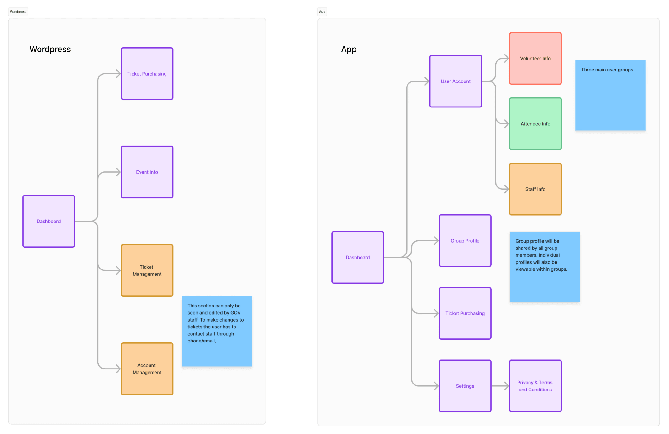
I began by studying the existing WordPress website and building upon it to add features. I created a new site map to guide visual design.
I began by studying the existing WordPress website and building upon it to add features. I created a new site map to guide visual design.
The first step was to understand the old system built on WordPress for handling ticket sales and build upon it to add ticket management, account management, scheduling, and event updates. I utilized UX tools such as site mapping, information architecture, user journey mapping, and persona building to guide my planning. Next, I converted this research into UI designs, including sketches, wireframes, and prototypes. Additionally, I created a comprehensive branding guide specifically for web design.
The first step was to understand the old system built on WordPress for handling ticket sales and build upon it to add ticket management, account management, scheduling, and event updates. I utilized UX tools such as site mapping, information architecture, user journey mapping, and persona building to guide my planning. Next, I converted this research into UI designs, including sketches, wireframes, and prototypes. Additionally, I created a comprehensive branding guide specifically for web design.
Design Iteration
Creating an appealing design system for youth.
Creating an appealing design system for youth.
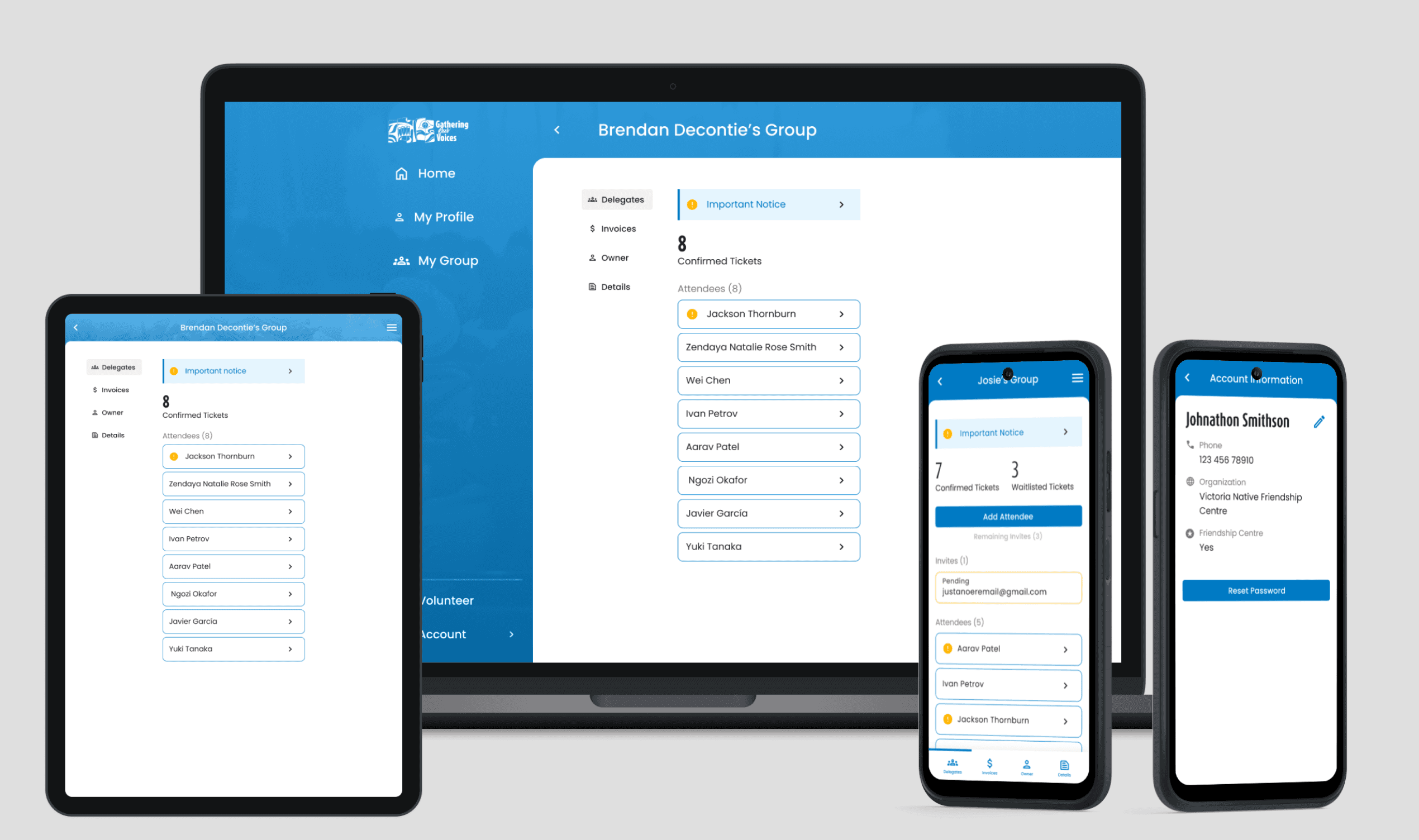
Gathering Our Voices had an existing style guide for their website, but I needed to expand it for the app. The primary challenge was designing a vibrant and youthful interface while maintaining a meaningful and cohesive aesthetic. For instance, the event assigned specific colors to different user groups—green for volunteers, purple for participants, and so on. However, they preferred not to use a full rainbow palette (which was part of their style guide) to avoid the impression that the event was exclusively LGBTQ-focused.
The challenge was balancing the need to distinguish user groups while maintaining visual continuity. If volunteer information was predominantly green and participant information was purple, it sometimes created the impression of separate apps for each group, which was confusing.
To address this, I used color combinations on the homepage and other general pages, blending elements from the palette to establish a unified brand identity throughout the app. This approach ensured a consistent experience while still respecting the color distinctions for user groups.

Challenge
Optimized responsive design by prioritizing mobile-first layouts for youths using the app on the go, while keeping tablet and desktop designs consistent with minimal changes.
Optimized responsive design by prioritizing mobile-first layouts for youths using the app on the go, while keeping tablet and desktop designs consistent with minimal changes.
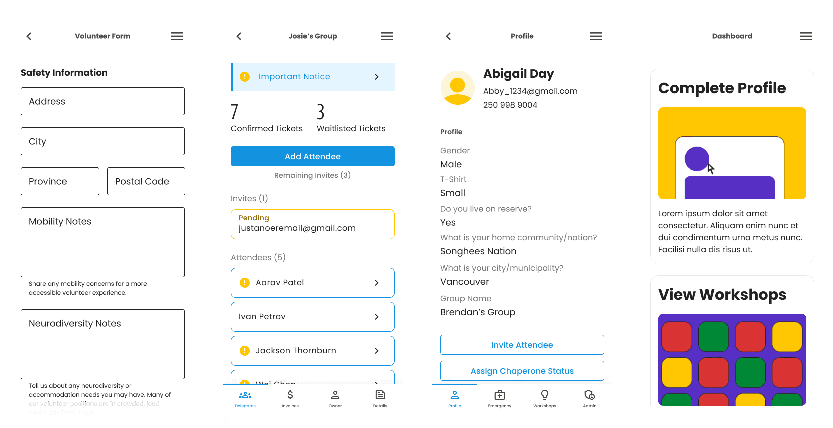
Designing for responsive layouts quickly proved time-consuming, prompting us to pivot our approach. Since different features would launch at staggered intervals, we prioritized device and screen sizes based on each feature's expected use. For instance, as ticket sales were most likely to be completed on mobile devices, we focused on optimizing designs for smaller screens first, ensuring a seamless user experience where it mattered most.
We also established clear breakpoints, realizing that the design for tablet and desktop could remain consistent with minimal adjustments, but mobile required a distinct approach. Following innovative UX best practices, we developed a mobile-specific design tailored to our primary target audience—youths who would be using the app on the go throughout the conference. This ensured the app was both functional and engaging for its core users.
Future
In the future, I would have altered the design to be more minimalistic, and removed the color combos because they added to confusion rather than build brand consistancy.
In the future, I would have altered the design to be more minimalistic, and removed the color combos because they added to confusion rather than build brand consistancy.
Google shares many of the same colors as the GOV brand but achieves a modern, minimalistic look by using color selectively to highlight key areas. Adopting this approach for the GOV app could have made it more visually appealing and aligned with contemporary UI standards. By focusing on single colors for specific uses, users could easily associate each color with its purpose. Since user groups were unlikely to encounter pages not relevant to them, concerns about color overlap would have been unnecessary.
Google shares many of the same colors as the GOV brand but achieves a modern, minimalistic look by using color selectively to highlight key areas. Adopting this approach for the GOV app could have made it more visually appealing and aligned with contemporary UI standards. By focusing on single colors for specific uses, users could easily associate each color with its purpose. Since user groups were unlikely to encounter pages not relevant to them, concerns about color overlap would have been unnecessary.

Get the Conversation Started
Thanks for stopping by! If you’re thinking, “Wow, I need to work with this person,” you’re absolutely right. Let’s make it happen—reach me on LinkedIn or drop me a line. I promise I’m as cool as this footer makes me sound. 😎
Get the Conversation Started
Thanks for stopping by! If you’re thinking, “Wow, I need to work with this person,” you’re absolutely right. Let’s make it happen—reach me on LinkedIn or drop me a line. I promise I’m as cool as this footer makes me sound. 😎
Get the Conversation Started
Thanks for stopping by! If you’re thinking, “Wow, I need to work with this person,” you’re absolutely right. Let’s make it happen—reach me on LinkedIn or drop me a line. I promise I’m as cool as this footer makes me sound. 😎
Get the Conversation Started
Thanks for stopping by! If you’re thinking, “Wow, I need to work with this person,” you’re absolutely right. Let’s make it happen—reach me on LinkedIn or drop me a line. I promise I’m as cool as this footer makes me sound. 😎